Creating Consistency
How many of us want to create a memorable brand that stands out from the crowd? I hope the answer is a huge 100% of us! When it comes to building a memorable brand, it is all about CONSISTENCY. Consistency in everything you do from imagery, videos, language, fonts, colors and more.
But consistency isn’t the easiest thing to do. If it was, anyone could do it! Companies can get a little lost while trying to maintain a consistent brand identity. Thinking about your ad campaigns, website, social media updates, and printed materials… it’s a lot. The lack of consistency in your brand may not be noticeable at first, but failing to be consistent can leave a negative impact on your business.
The best brands stick out in our brains because their presence is defined by the repetition of the same logo, fonts, colors, and images. Take HelloFresh for example: the bright green color and lime icon, the mix of trendy and playful fonts, and the tone of voice and mission to help every household enjoy wholesome home-cooked meals with ease is consistent in everything they do. This consistency with their branding has helped them take the health and food market by storm and become the leading healthy food delivery company worldwide.
Brand consistency is the pattern of expression that affects what people think about your company. The more consistent you are with your words, designs, offerings, and perspective, the more consistent your brand is. Let’s look a bit deeper at what we do at Marketing TEA to make sure we are building brand consistency.
At Marketing TEA, we believe that health and wellness practitioners have the potential to leverage their digital presence to change lives.
Everything we do is centered around this philosophy. We cater to wellness centers, birth centers, fitness professionals, dentistry practices, midwives & doulas, and anyone in the healthcare profession that wants to grow their business and share their message with the world. When we decide our style and message, we keep in mind what speaks to those health and wellness businesses. This works because our mission aligns with the healthcare industry. At our core, we are centered around living & promoting healthy lifestyles and sharing them with the world.
Marketing TEA’s voice is optimistic, motivating, relatable, and conversational.
When crafting copy for social media posts, website copy, and marketing materials, we strive to keep those words at the top of our minds. While the goal for each piece of content is different, our overall tone of voice stays consistent.
We make use of motivating potential clients to realize their unique potential and how we can help them achieve it. It is important to keep our brand relatable and conversational so that our clients and friends can connect with our brand and our mission emotionally as well as feel familiar and comfortable with us.
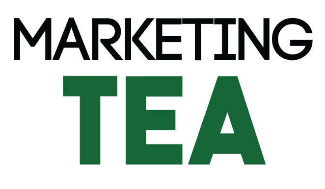
Marketing TEA’s colors are dark green, light green, and black.

Green is the color of nature. It symbolizes growth, harmony, freshness, and fertility. Green also has great healing power. There really is no better color to represent Marketing TEA and drive home our mission.
Our fonts were chosen because they provide strength and clarity for the brand while also having small spacing elements, like in the ‘R’ and ‘K’ to provide a relatable and uplifting feel.
Marketing TEA has different variations of the logo to use in different situations.


Every brand should have logo variations because there will be times that you might need your logo in a horizontal form, like for a header, a small version for a watermark on social media, and even ones for a light background versus a dark background.
You will also want to make note of anything that makes your logo unique and specific so that whoever uses your logo knows the correct way to assemble it. For example, our teacup should always go above the text, not below.
Marketing TEA’s iconography is the teacup.

The teacup is a great way to assist the name and reinforce the relatable, conversational nature of the brand.
Marketing TEA’s photography style stays true to the optimistic and natural feel of our brand.


Our video and photo production make strong, immediate connections between brands and their audiences. Our imagery revolves around our key approach of creating a strong brand built on content that engages, informs, and intrigues your target clientele. We are consistent with the style of photography, the editing we use, and the way we tell your story through graphics and pictures to drive home our own brand identity. Our goal is that when people see our work, they know Marketing TEA was behind it.
____________________________
A great place to keep all of the above information in a place that is handy for you and your company, is a brand guideline. Brand guidelines can help you build awareness and customer loyalty, as well as simplifying communication efforts across the board. Interacting with consumers through a consistent brand voice and aesthetic is a major step in creating a memorable brand that stands out from the rest!
Let’s build your consistent brand together!